
By LumionVietnam · Documentation checked 25 October 2026
A modest library should feel like a place you can enter. Yet an exterior image can make it read as a tabletop model: the door is lost in glazing, the ground has no texture scale, and every tree is taller than the roof. More detail will not necessarily fix that. Start with four pieces of visual evidence the viewer already understands.
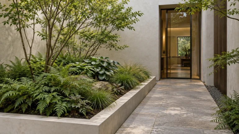
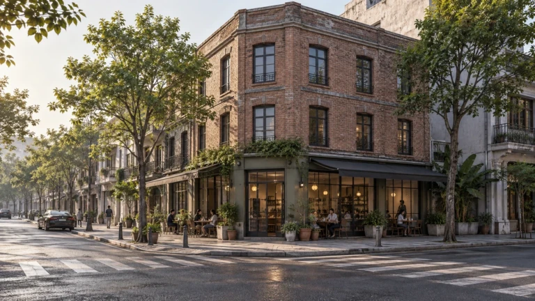
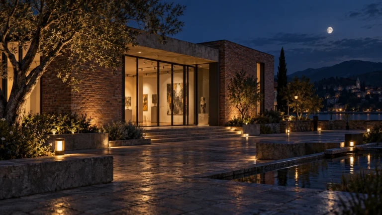
Featured image: Original LumionVietnam AI-assisted editorial artwork. Conceptual illustration, not a software screenshot, verified project, benchmark or actual software output.
Start with one locked camera
Save the view before changing the scene. Keep the building geometry, lens, camera position and output crop fixed for the first comparison. Otherwise a closer camera can make the entrance look larger while hiding whether the scale problem was solved. Export a quick proof and write down the one question it must answer: “Can a first-time visitor understand the size of this entrance?”
Use the model’s real units. Check a known element against the drawing rather than assuming that a door or person asset imported at the right scale. A beautifully shaded object can still be ten times too small.
1. Let the entrance provide a familiar reference
Find the doorway, threshold and handle in the proof. If they merge into a dark glass wall, try a small change in lighting or material separation. Make the route to the door legible. A canopy, reveal or entrance recess can communicate depth if it exists in the design; do not invent one to improve an image.
Do not enlarge doors for visual effect. Compare the modeled dimensions with the project schedule, then check the camera. A low or very wide view can exaggerate the foreground and make the entrance recede.

2. Give the building a convincing meeting with the ground
Inspect the base of walls, step edges, paving joints and planting beds. Look for floating geometry, repeated gaps, intersecting surfaces and a ground plane that passes through the facade. Fix those relationships in the model before trying to deepen shadows.
A dark outline is not automatically a contact shadow. If the whole building has the same black border, examine material contrast, ambient-occlusion effects and overlapping surfaces. Keep a clean proof without heavy post-processing so the junction can be judged.

3. Use paving and materials as secondary scale cues
A paving pattern gives the eye a repeatable unit. Match its size to the specification or an explicitly provisional design assumption. Then inspect the texture both near the camera and beside the door. Huge joints can make a small facade look miniature; tiny repetitions can create noise without explaining scale.
Use the same check for brick courses, timber boards and roof seams. The correct repeat dimension matters more than how sharp the texture appears at a thumbnail size.

4. Add entourage that supports the building
Add a small number of context objects with verified dimensions: a bicycle at the entrance, seating along a path, or planting of a believable maintained size. Choose assets that fit the place and use. Keep access clear and avoid placing every object on the same depth plane.
A person can be helpful, but is not compulsory. A conspicuously posed figure or oversized ornamental tree can attract more attention than the entrance. Toggle entourage off and on. If the building becomes understandable only when half the facade is hidden, revisit the earlier checks.
A five-minute review
- Compare the entrance with the drawing or schedule.
- Inspect three ground junctions at full image size.
- Check one paving or facade repeat against a known dimension.
- Hide entourage and confirm that the building still reads clearly.
- Compare the final proof with the locked-camera baseline.
FAQ
Should every exterior contain people?
No. Doors, steps, paving and contextual objects may already explain scale. Add people when they clarify occupation or use.
Can I fix scale by choosing a longer lens?
Changing focal length changes framing. Moving the camera to restore the framing also changes perspective. Test those choices separately so you understand what improved.
For a complementary visual review, read our render composition quiz. Scale and composition solve different questions; judge each on its own evidence.
Official sources
Categories: Architectural Visualization · Architecture & Visualization Journal
Tags: architectural visualization · render composition · rendering
Continue Exploring